
Family History Hero Has Moved
We’re now MyAncestorBox.com
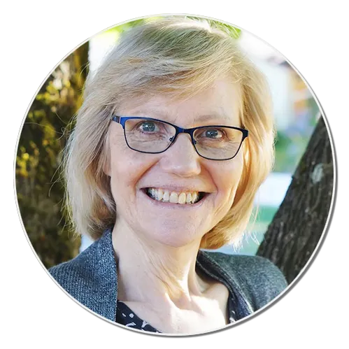
Linda Sattgast
Your Guide
Linda Sattgast has been inspiring family historians through her online classes since 2003.
Linda has taught for Adobe, Epson, PBS TV, been featured by HP, has been a columnist for Photoshop Elements Techniques magazine, and a CD of her training has been featured four times in the Adobe Photoshop Elements box at Costco.
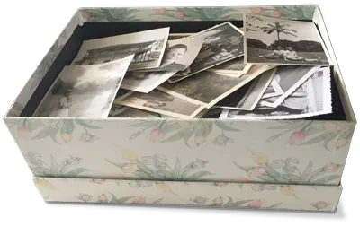
Linda’s passion is to empower the “Paper Photo Generation” to turn their boxes of photos and memorabilia into sharable family treasures before it’s too late.
Featured by

Already A Student? Classroom Login
For Support Issues or Questions, Please Send Us An Email
Terms of Use | Privacy Policy | Contact Us | All Rights Reserved. © 2026